Hello! I'm a senior product designer with a background in illustration. I enjoy working in
complex data heavy spaces and trying to bring delight to users who are used to the mundane.
Status: In progress for beta (at time of writing) Role: Lead designer Timeline: 4 months
What is it?
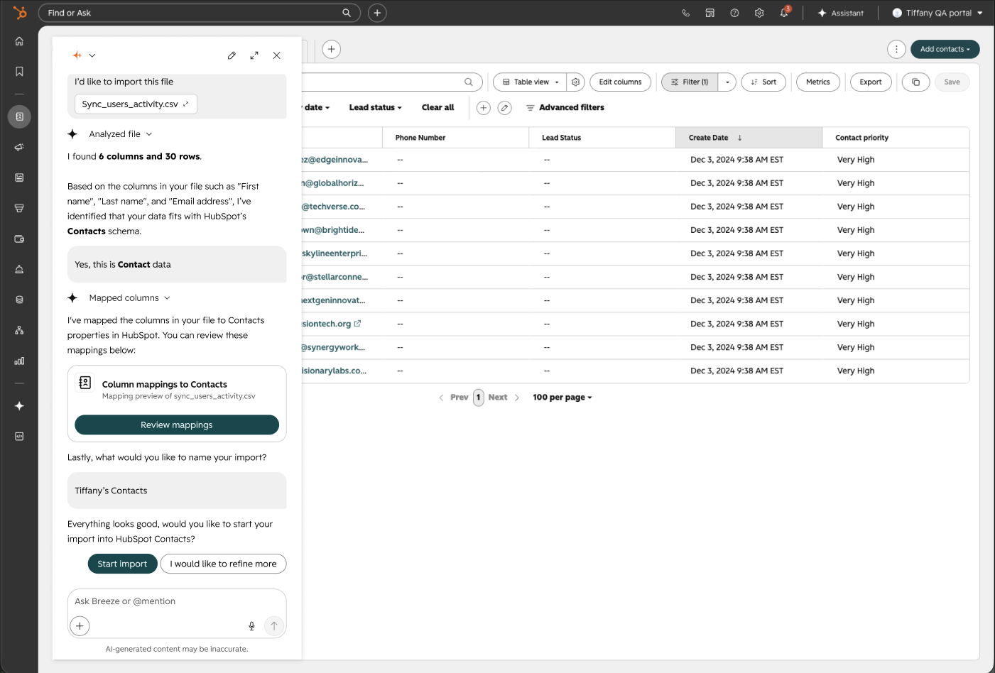
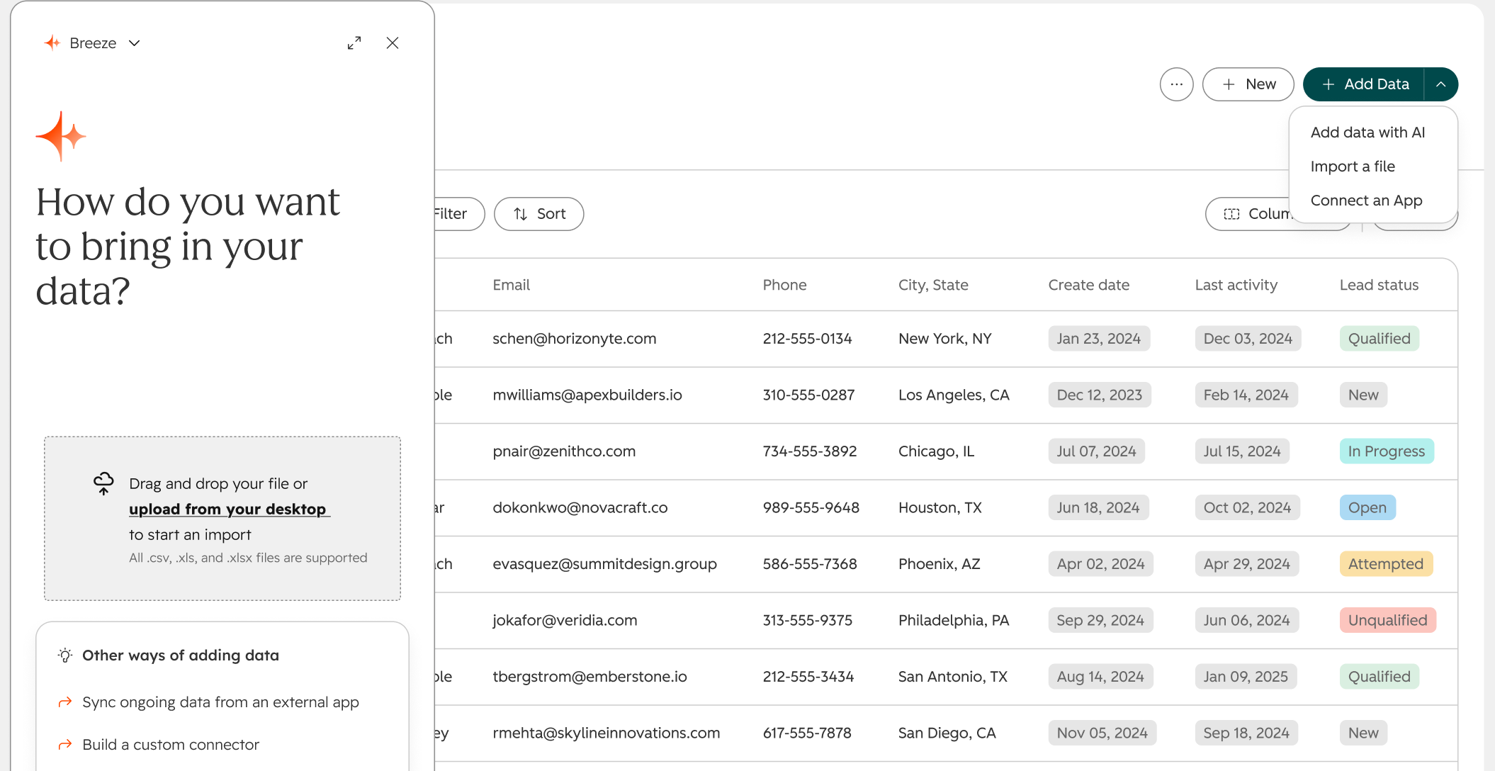
This feature leverages HubSpot’s existing AI assistant to import files through the chat interface, so importing can be done anywhere with easy troubleshooting and guided setup. This simplifies and speeds up the imports process for all HubSpot users.
What problems is this solving?
New customers are overwhelmed by UI heavy legacy imports flow
Drop offs throughout the flow
Column mapping between users file and HubSpots schema is daunting, painful, and extremely error-prone
File upload friction slows down onboarding
Goals
Leverage AI to reduce time spent on importing files into HubSpot CRM
Guide HubSpot customers of all technical levels through a burdensome workflow
Decrease the amount of errors made during imports
Explore user confidence in letting an AI assistant manage their data
Constraints
Anything agentic needs to be built on HubSpots AI assistant
Building out AI capabilities was new to my engineering team, so much of this was discovery
We would be pioneering agentic file import for the company, so there weren’t existing patterns to refer to
Design process
I have previously identified and surfaced the burdensome importing UI a few months before this work began, but it wasn’t until this year that my engineering team had the capability to integrate this into the AI assistant.
Since the HubSpot AI assistant could be used anywhere throughout the CRM, I came up with the design where the import process could exist mostly in chat, and be lightweight and portable. For example, this would mean that a user setting up an automated workflow could summon the AI assistant chat, import a file, and immediately be able to use that imported data into their workflows.
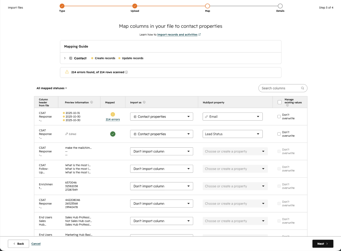
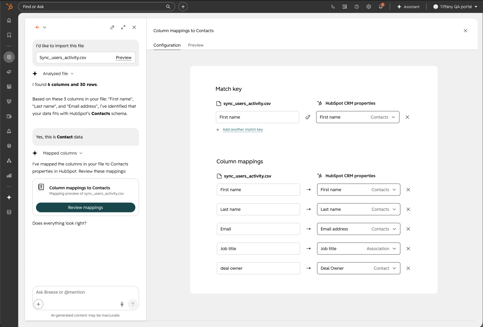
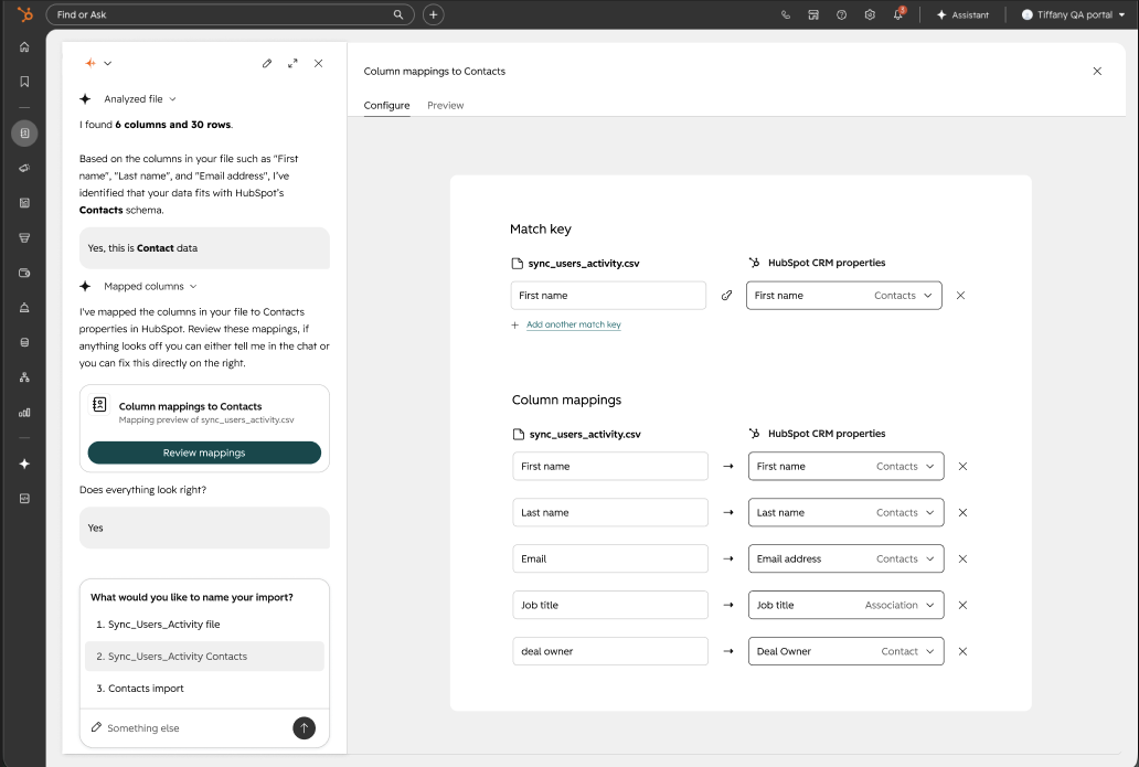
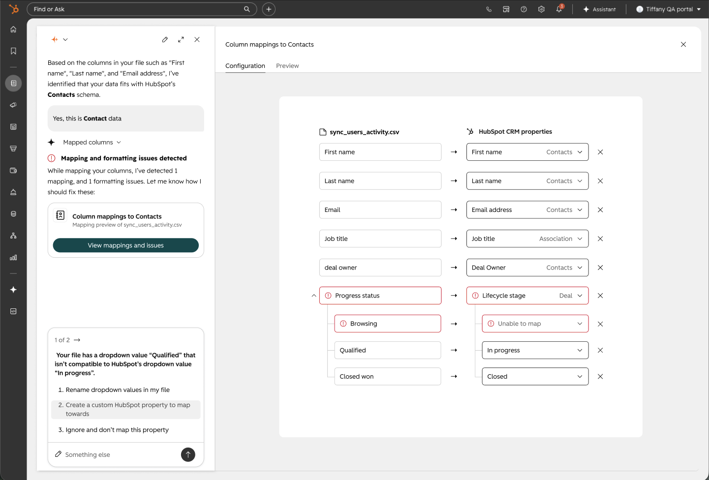
I included all the requirements and jobs to be done from the existing imports flow into the AI chat. From there users would be able to select options or type in questions to help with troubleshooting. From my previous knowledge of working in Data Sync and talking to customers for years, I know that field mappings is a huge pain point. This is where I wanted to put most of the work on to the AI assistant. Below are a few examples of before and after comparisons of the manual import flow vs. the agentic imports.
Field mapping
Current: Users have to manually fill out every dropdown
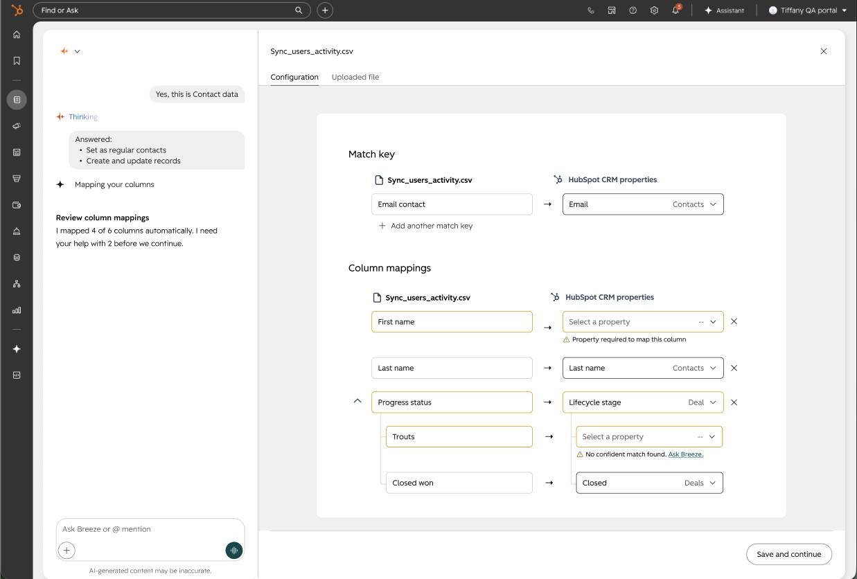
Proposal: A cleaner view of field mappings, with everything automapped for user-review to work with all ingestion flows.
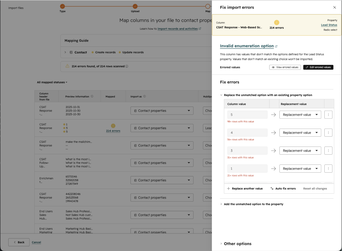
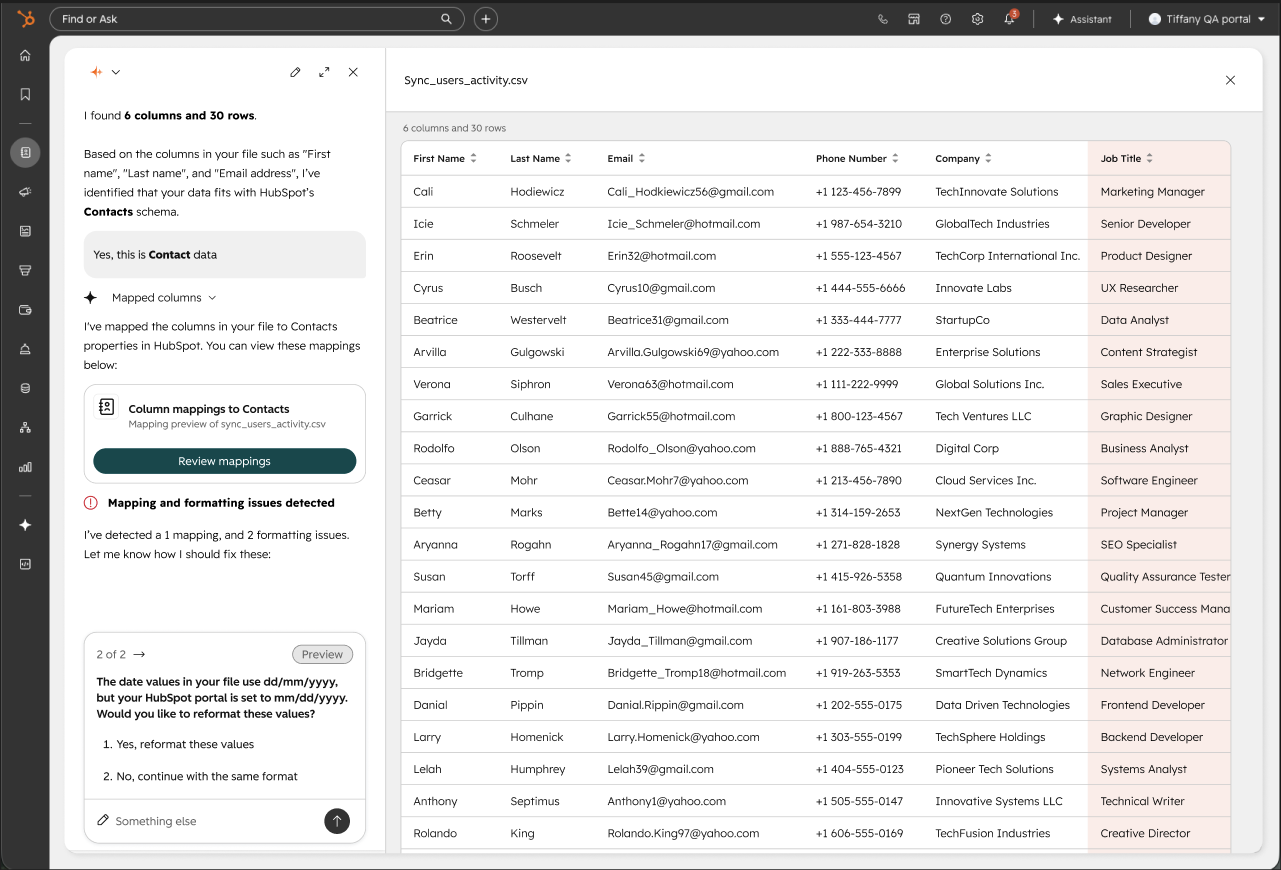
Reformatting values
Current: Reformatting UI was confusing and hidden
Proposal: Automatically detecting inconsistent formatting, suggesting and executing fixes with user permission.
Usability testing
After designing these improvements and changes, I arranged and tested this claude prototype with 6 users.
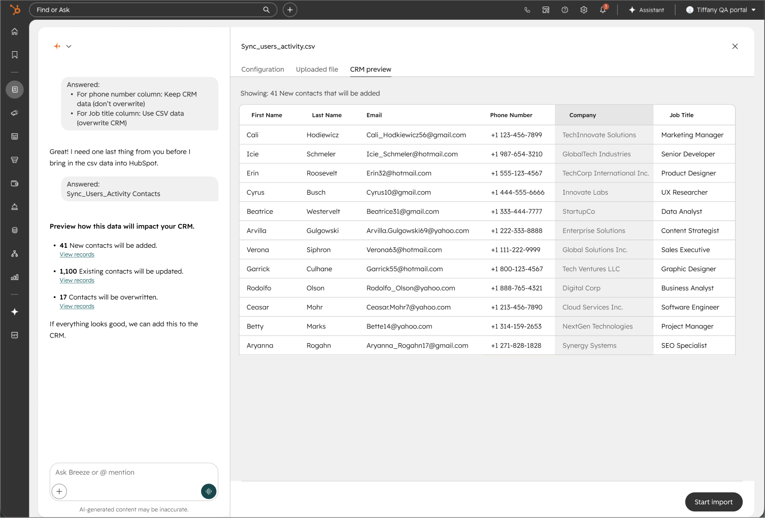
Overall users had positive reactions to this prototype. It was clear that this would be a significant improvement for users day-to-day work. However all of them have said that they wanted a preview of what that data would look like, in the CRM before they click “Import”. Data preview was becoming more needed throughout all data ingestion and transformation features.
Users seem very hopeful about the AI technology but it’s very fragile. If we made a silly mistake in mapping or guessing the corresponding HubSpot object, that trust would be broken. As I shared these findings to stakeholders, this is something I emphasized to engineering. One of the questions my team had was “do users want quick auto-mapping with a higher chance of mistakes? or do they want more accurate automapping with no mistakes?”. From my research, users wanted the latter.
Improvements from usability testing
At this point in the process we started to collaborate with the AI design team within HubSpot, some components were not supported on the current version of the AI assistant chat so we had to make some adjustments in addition to user feedback improvements.
Preview of data changes
Prototype: No preview of all the changes that will be made
Final design: Preview options for all the data changes that will be made to the CRM
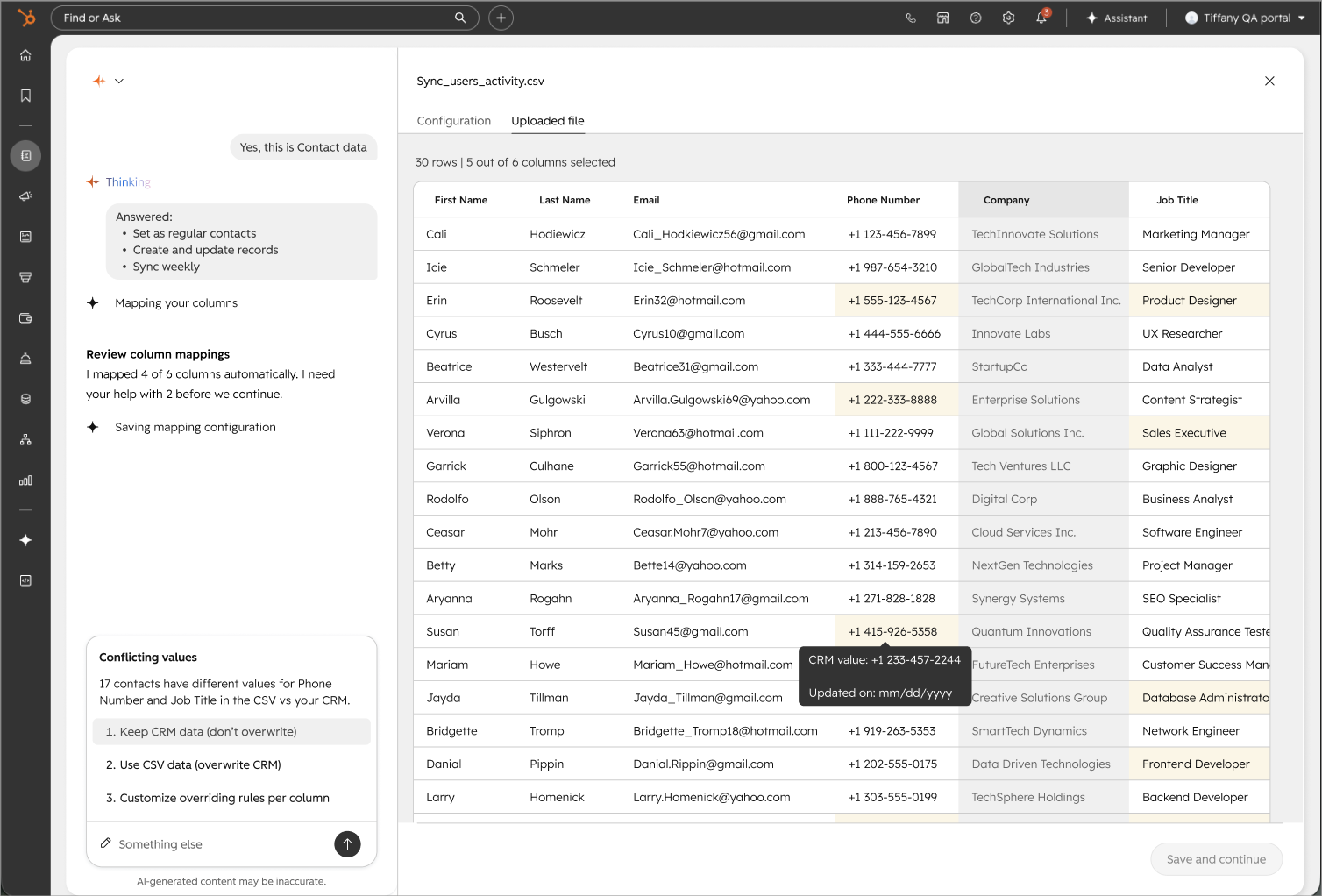
More control of overwriting data
Prototype: No option to say what fields can/ cannot be overwritten
Final design: Gives users the option to control what data can / can not be overwritten, with the option to specify per field
Bulk error handling
Prototype: Too many errors would result in many clicks
Final design: Gives users the freedom to either resolve this themselves, or prompt the assistant for suggestions
Next steps
At the time of writing this, the engineering team is in the middle of building it out for our beta test. I planned on reaching out to those users and using the real product, conduct beta testing as if it were like usability testing.
Thoughts
What went well: This work was experimental for the team. We reduced alot of burdensome manual work to a couple of prompts, asked and scanned by the AI assistant.
What didn’t go well: Because this work was experimental, this project took longer than usual due to multiple sprints of research and discovery.
Terra workflows on Azure
Role: Lead designer Timeline: 6 months
What is it?
Terra is a genome analysis platform that enables scientific researchers to run analyses and share data and findings with others around the world.
Terra is expanding its cloud storage options to include Microsoft Azure after only supporting Google cloud for years to expand their userbase. The user experience could not match what was previously offered on Google-Terra because of backend limitations on how data is stored.
What problems is this solving?
Researchers in other countries would be able to use Terra to do analysis on their data sets (which are not allowed to leave the country) because of how Azure data is stored. This solves for data security since many countries have regulations on where their data is being stored.
To expand the userbase to enterprise customers who use Microsoft Azure.
UX Goal
Ensuring that researchers can conduct their analysis in Terra on Azure with the best experience possible given the technical limitations of MVP.
Constraints
Users would have to “start/stop” back end analysis services and would have to spend money to use a service that was previously free.
Small engineering team + a tight deadline driven by Microsoft Azure means alot of preferred user experience will be cut for the first round.
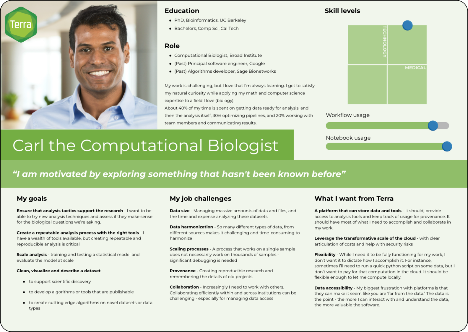
Targeted persona: Computation biologists that rely on user interfaces
Persona card created by previous design team members
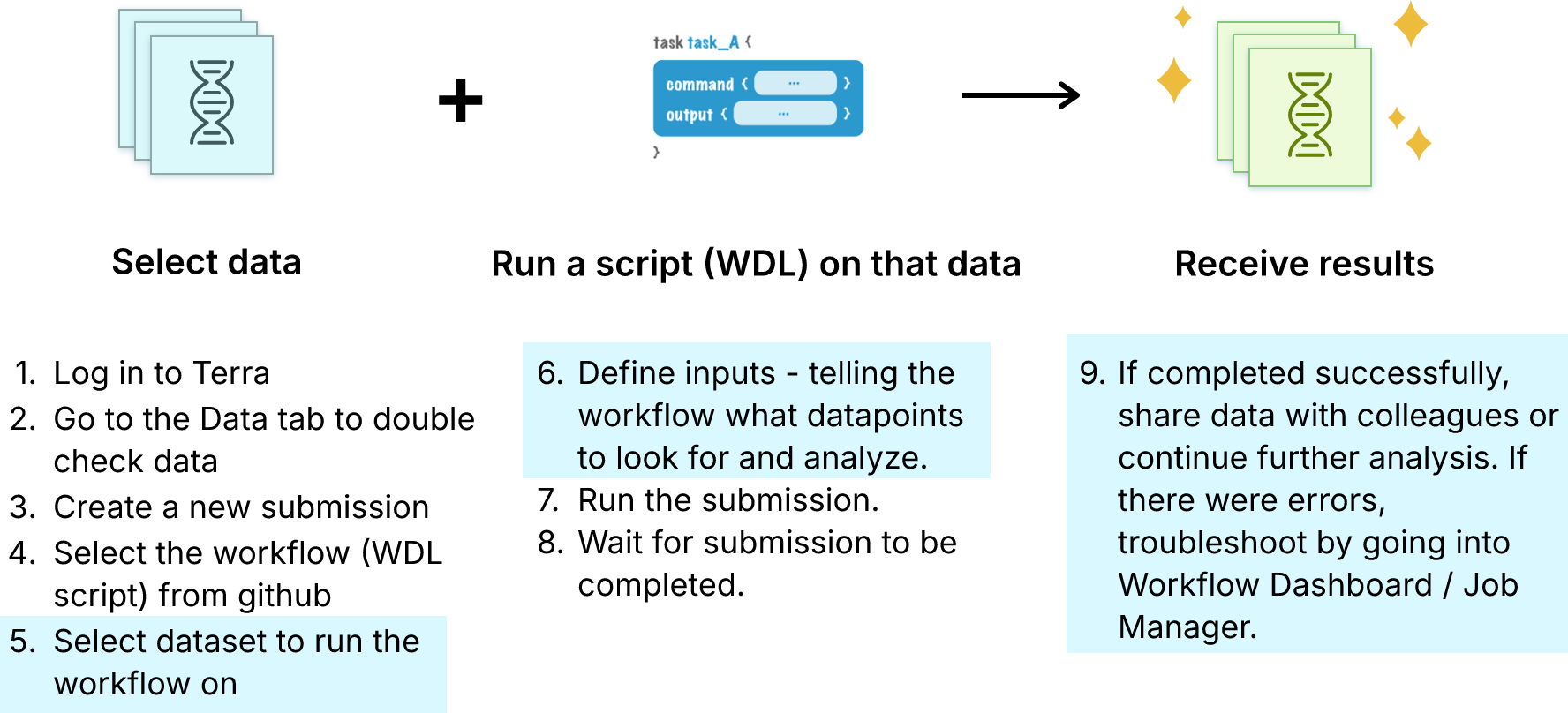
What is batch analysis?
Pain points that I (along with my product manager) identified through user interviews, casual feedback, and conversations with customer support.
Addressing these pain points did not make it into the MVP due to time constraints but became part of the road map for 2023 for two engineering teams.
A key feature of Terra on Azure is conducting Batch Analysis (used by 60% of Terra users).
Design process
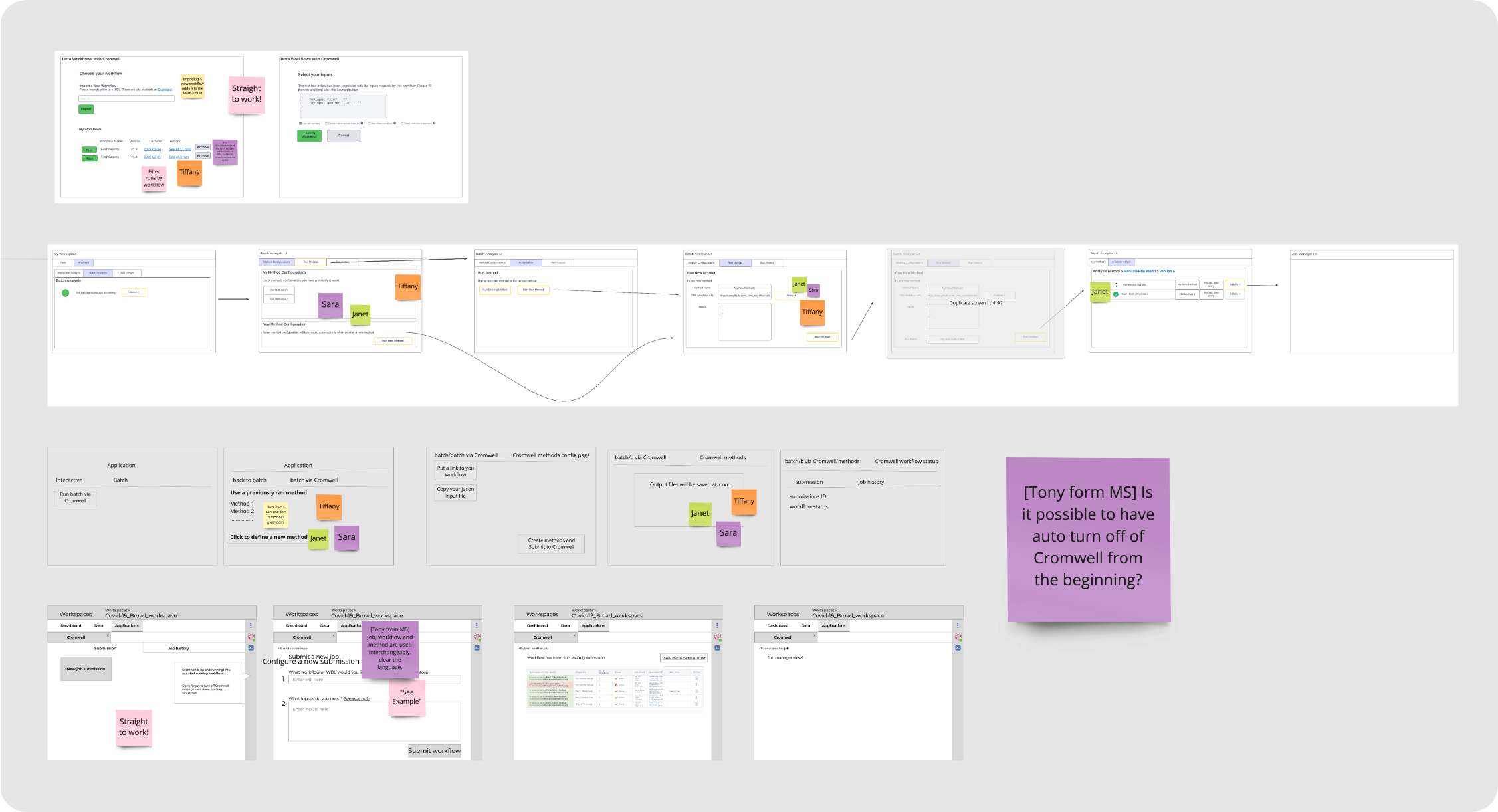
My product manager and I included our lead engineers in the process. We had a mini design workshop where everyone brainstormed and drew their concepts on an MVP Batch Analysis process.
I realized that in order to make progress we needed to meet regularly so I set up weekly sync meetings and included the engineers in usability testing and user interviews.
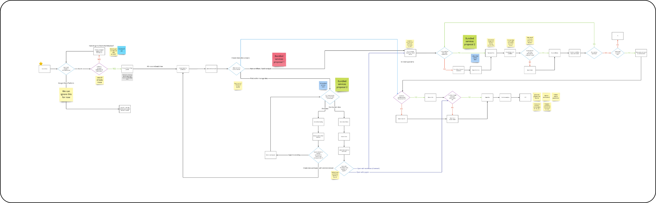
Workflow submission flows created by UX, PM, and Engineering with sticky note votes
Usability testing
After conducting usability testing with 10 users, we started seeing some trends on what could be improved. Our biggest findings were:
Users were neutral or happy about opening a new tab to continue their work. This was previously thought of as a pain point.
Autopausing services that incurred cost is a must-have feature. All users expressed concern over remembering to turn off their services after running their workflows.
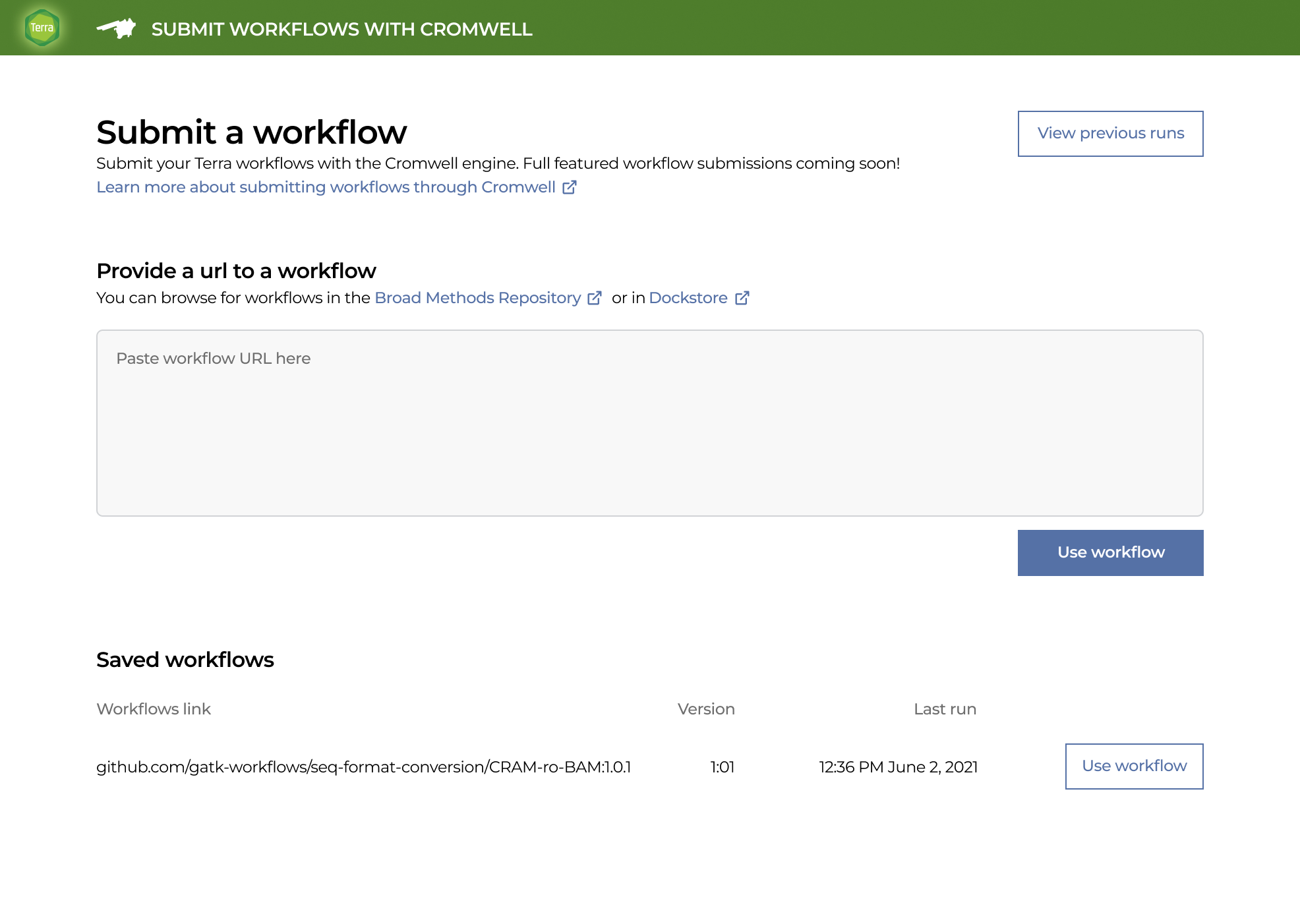
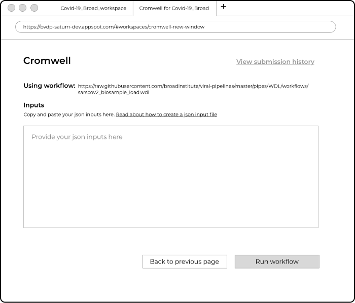
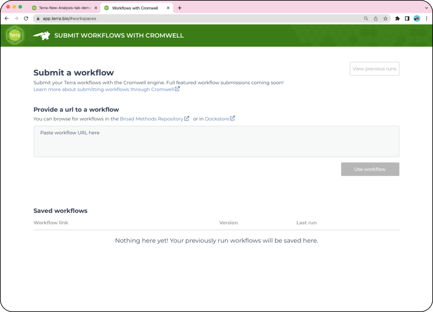
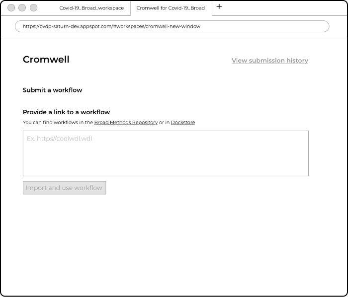
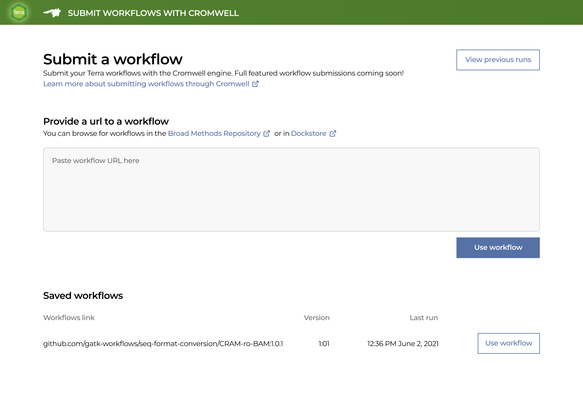
Users wanted to see their saved workflows when they open up the workflow submission window.
Workflow versioning is highly requested feature.
Better troubleshooting feature (a separate project underway).
Cost transparency
Better labeling
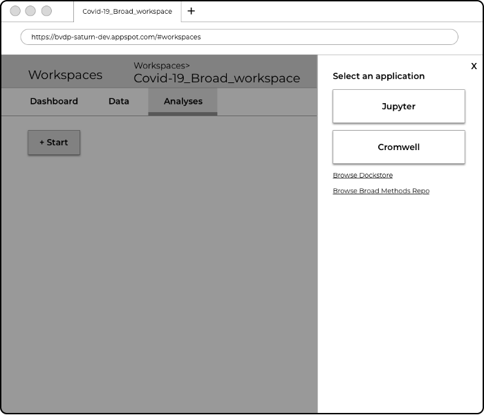
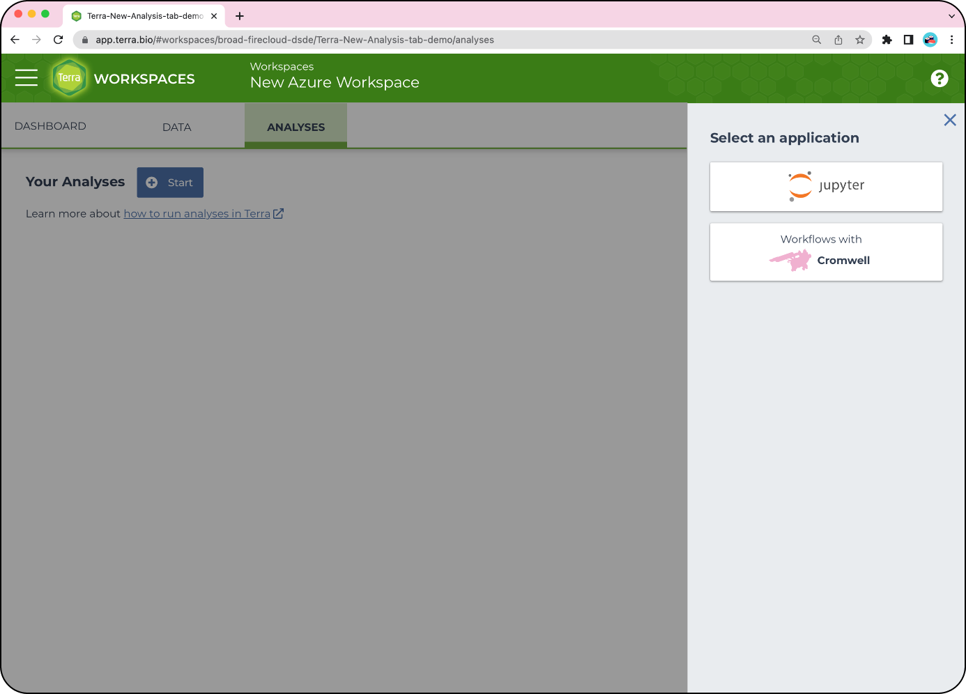
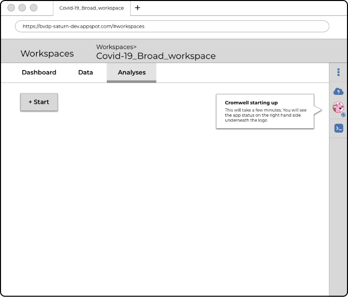
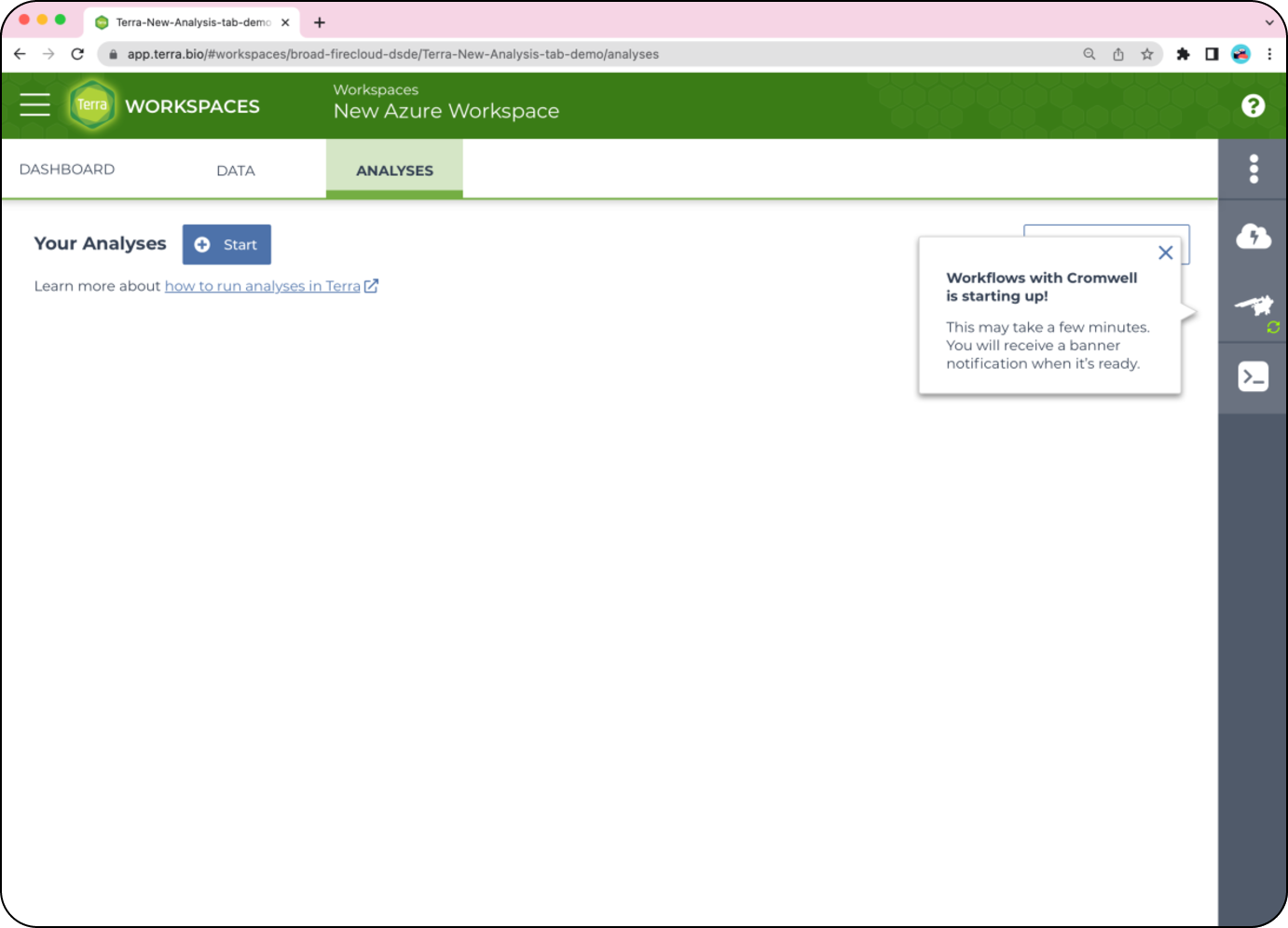
Prototype: Not all users know what “Cromwell” is
Final design: Updating text to say where to check on updates
Notifications
Prototype: Users want to know how they will be notified once this environment is ready
Final design: Labelling Cromwell with “Workflows with” if we are to support more Workflows apps in the future
Saved workflows
Prototype: Even though this is a new user, seeing their saved workflows was a common request for our testing participants. Users either had a neutral or pleased reaction to see this open in a new tab
Final design: Even if there are no saved workflows yet, I added in a section to show where workflows would be saved later on. Versioning is added here from the list above. We are confident that opening a new tab would not become a pain point.
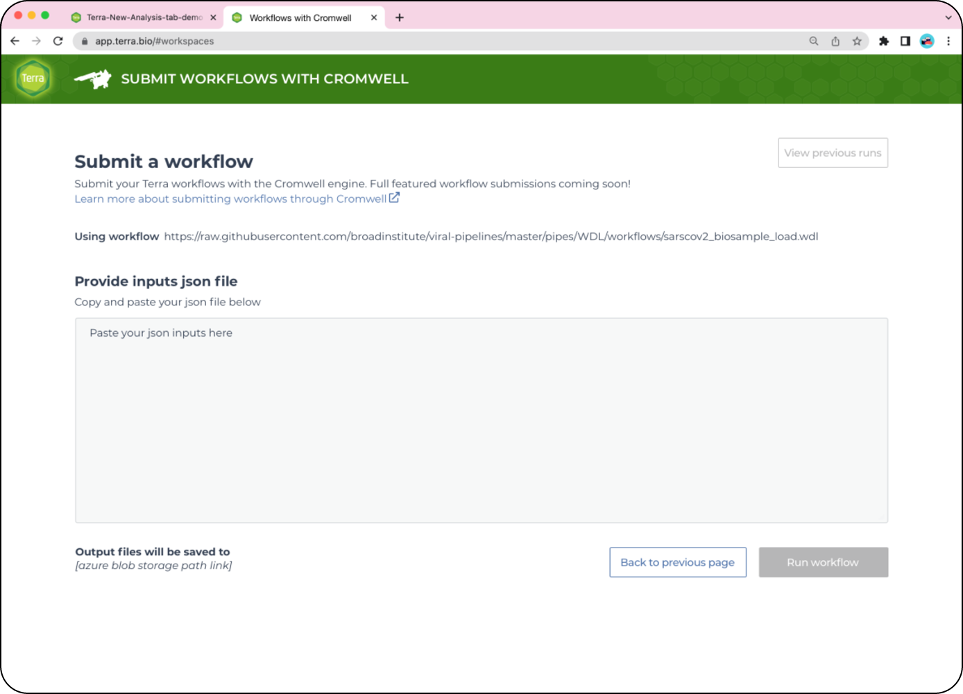
Output files
Prototype: Wanted to know where their output files would be saved
Final design: I added the file path to the outputs since direct links are not feasible for this MVP
Next steps
The MVP will be released next year and front end engineering work has begun after I presented concepts and findings to the team. After my PM and I identified pain points in the user journey, we have them planned in the roadmap for next quarter. I am currently working on the troubleshooting improvements for the next quarter.
I started mapping out the Batch Analysis process, Interactive Analysis process, and Finding Data user journey. Bringing this to multiple engineering teams, we identified a few areas where there were multiple “service start up times” along the user journey which would become repetitive pain points for the user. We’re looking to combine services being spun up to decrease this friction and wait time.
Minor design updates would be needed to properly communicate and reflect this change. This is all still work in progress.
Thoughts
What went well: Increased trust and collaboration between UX/PM/Eng from including all parties in the design phases. Identifying pain points as future work on the roadmap even if we didn’t have the means to address them in the MVP. Usability testing uncovered what was a previously thought pain point, is not a pain point at all (multiple tabs vs. 1 tab)
What didn’t go well: Many improvements that would uplift user experience are not feasible in the MVP.
Mobile EPCS
Role: Lead designer Timeline: 6 months
What is it?
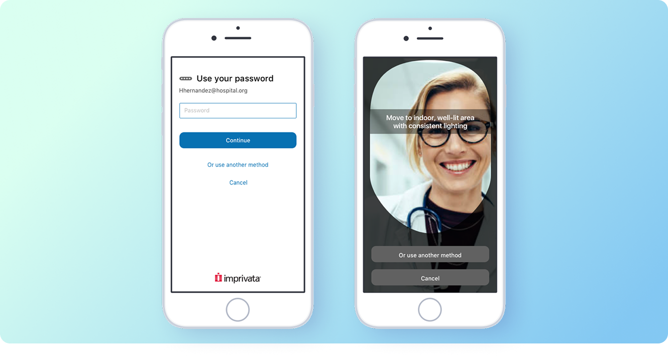
Mobile EPCS allows clinicians to sign off on controlled substances with two factor authentication. This was also the debut of a new authentication method - facial recognition. Note: The UX work of facial recognition was done by another designer.
The clinician would order the medications via their EMR (currently EPIC only) and this would prompt our token app Imprivata ID to host and pop up these authentication prompts.
What problems is this solving?
Clinicians who use EPCS (electronic prescriptions of controlled substances) are often required to sign off on prescriptions when they’re moving around in the hospital, or during off hours. Carrying a laptop and signing in is a clunky and burdensome process.
As we move to a more mobile-centric world and mobile EMRs are gaining popularity, we had to offer mobile signing features.
Challenges
Users may be uncomfortable with facial recognition
COVID! - Due to hospitals being over capacity, our users have declined their availability to provide feedback and usability testing.
The start prompt and success messages are controlled by the EMR, meaning we had no control over the start or the end of the experience.
This was our first foray into a mobile responsive interface, so it was a learning experience for the design team.
Design process
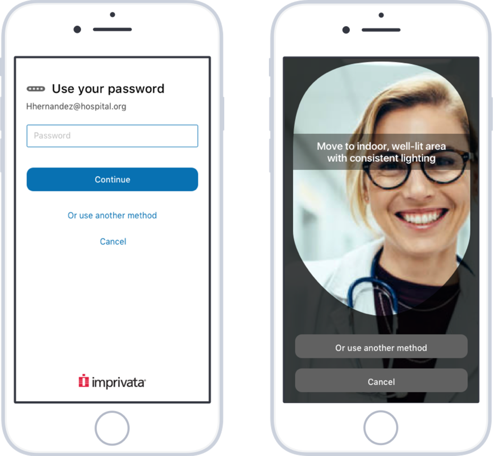
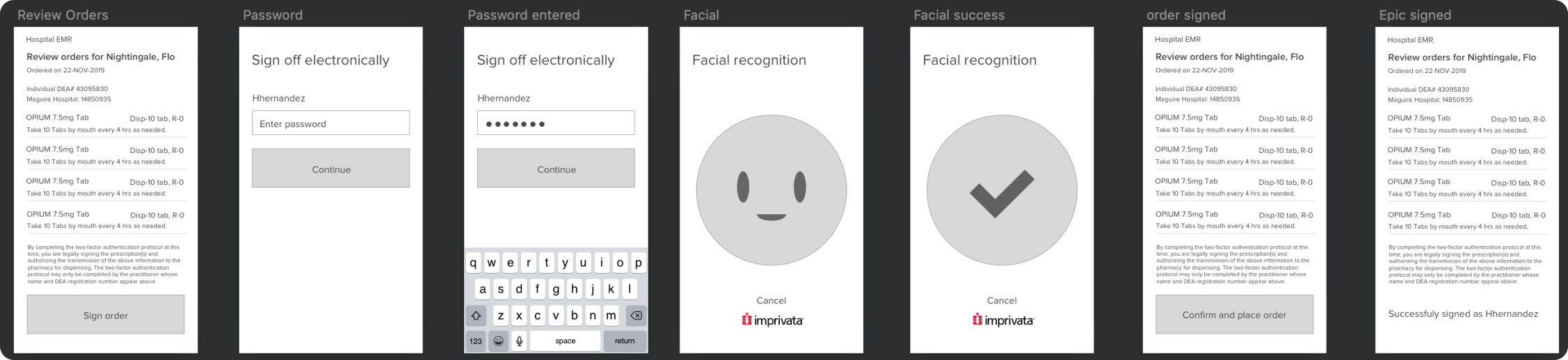
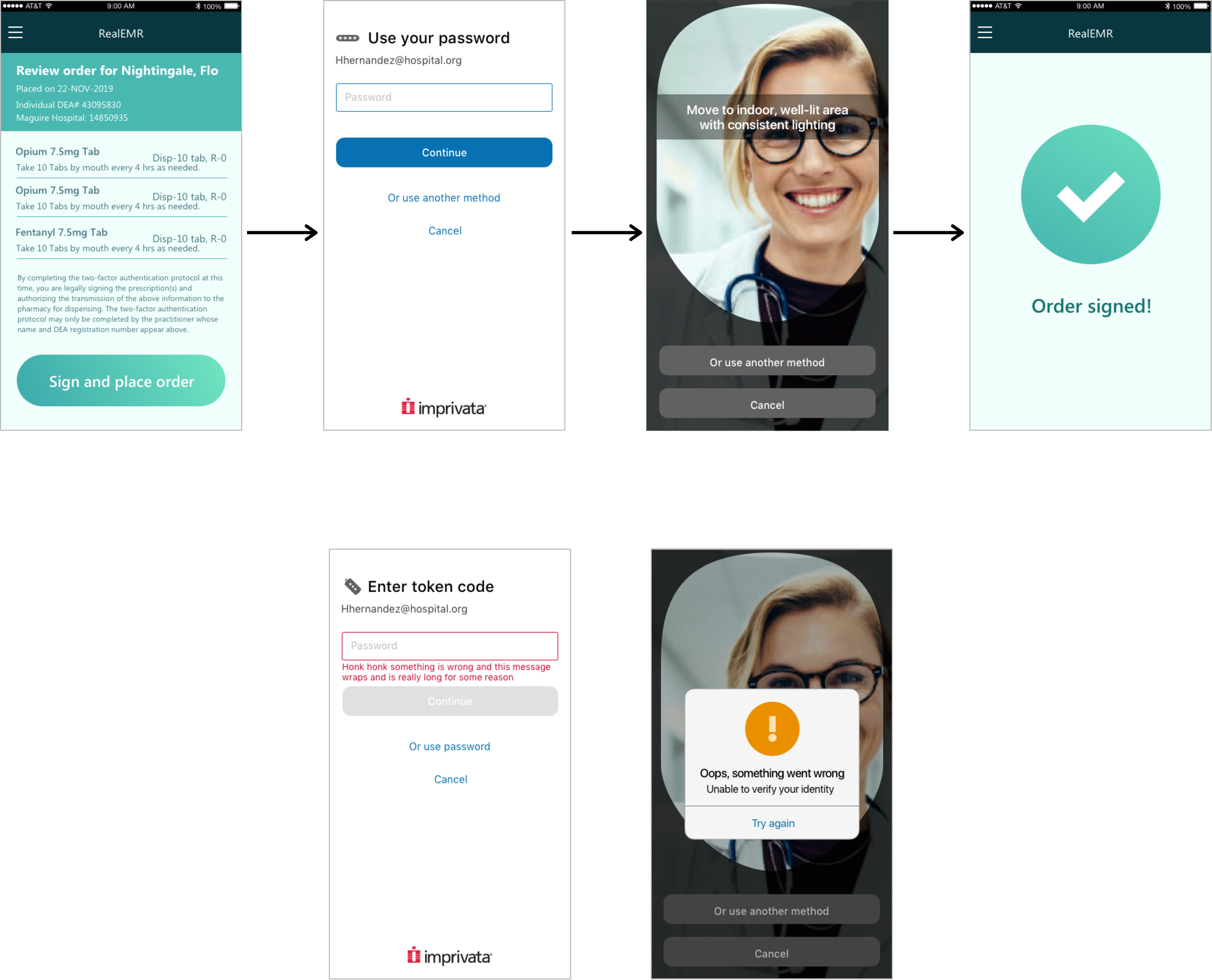
Clinicians would review the medications they needed to sign off, click on a “sign order” button provided by the EMR, and provide 2 of the 3 auth methods (password, OTP token, or facial biometric scan). If it’s successful, the screen will bring them back to their EMR with a success message. If it fails, they will need to re-try.
The flow was already a known item so concepting was fairly straightforward. I wanted to explore more visual options to make this tedious experience slightly more enjoyable.
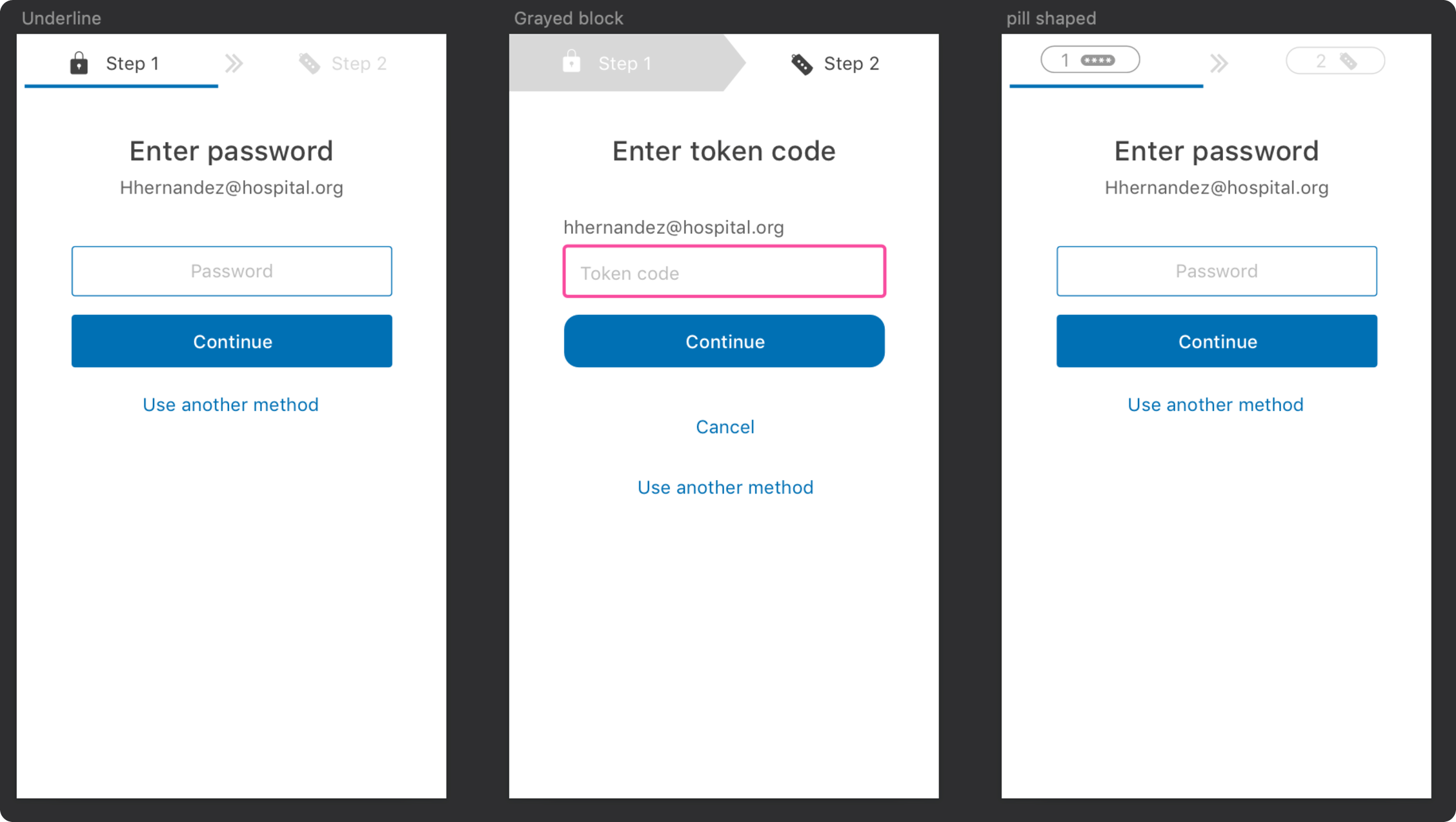
Initial wireframes done for stakeholder and potential buyer feedbackExploring options to show stepper processes at the top of the pageDesktop version of EPCS signing
I wanted to explore how a stepper would look on mobile, while also giving a hint on what auth method is needed next to give users a visual heads up. The arrow concept in the middle was a nod to our desktop agent interface, seen in red above.
Unfortunately we had to scrap the idea due to concerns of future features overcrowding the space and security concerns (mobile phones are easier to steal vs. onsite hospital desktops).
Supporting Android and iOS
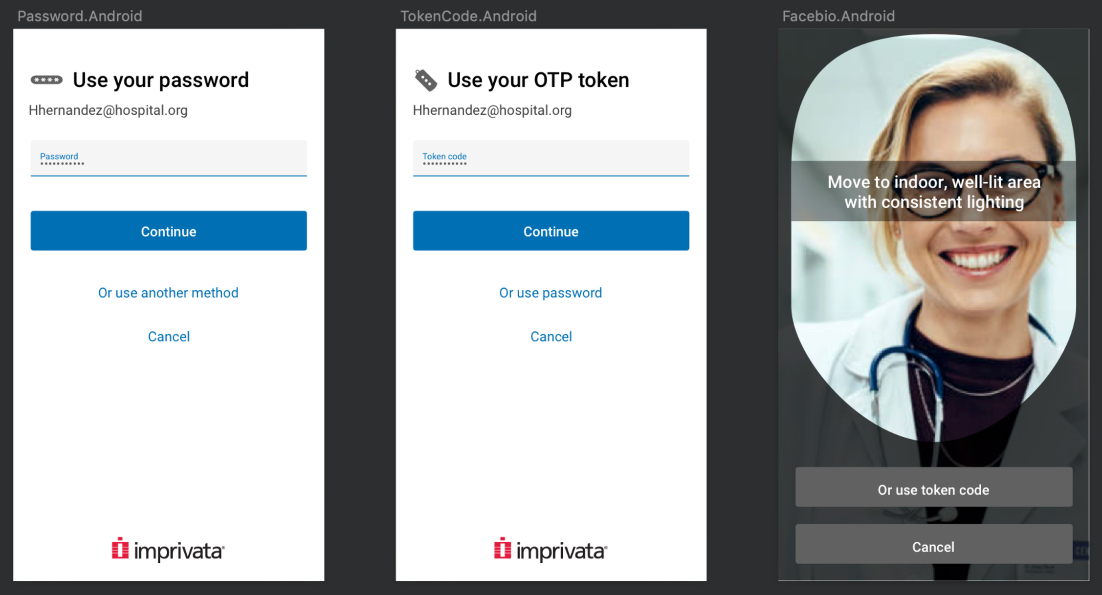
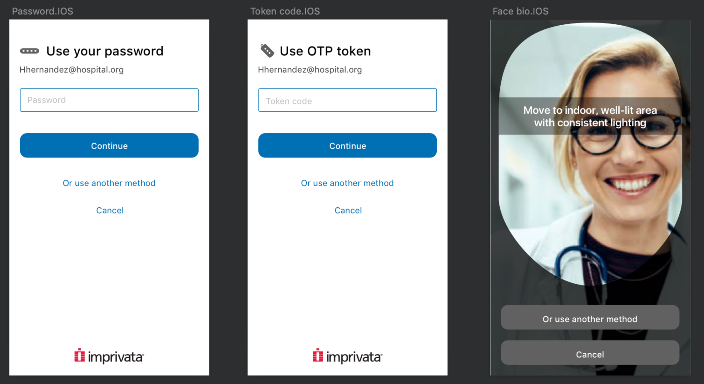
For android screens, we had to adhere to material design so I referenced material design guidelines for form fields and button shapes. For iOS, I referenced human interface guidelines.
I also had to create mockups of textfield interactions as a guide for developers as well. This was easier to find attached in the jira ticket vs. a link handoff where they had to search and read through a bunch of content.
Android variationiOS variation
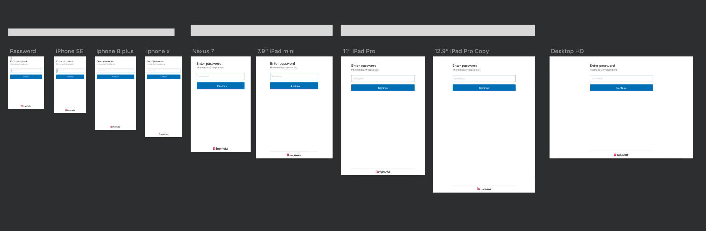
Responsive sizing
Responsive mobile work is very new to our design team since all of our products were desktop based for our clinician users. I had to do my own research as well as speaking to designers who have had experience working on mobile. Grabbing a supported devices list from the app store for the existing Imprivata ID app, I started to create a range of device sizes below and see how the screens work on each size. As I adjusted the textfields, 3 groups appeared for each type of sizing.
I worked closely with developers and QE / QA with testing and sizing. My engineers were actually the ones who raised concerns over the height of the buttons since the original ones kept the same height from small mobile phones to large tablets. I increased the height and text size accordingly.
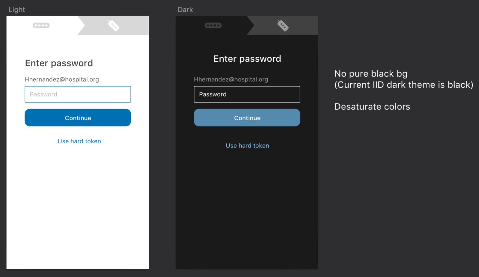
Dark mode concepts
As an avid dark mode user, I came up with concepts for a dark mode UI for those with sensitive eyes. We did not officially support dark mode in any of our current products so I had to do online reading to learn more. So far I’ve learned:
The “dark” portion should not be pure black since since this could make text harder to read (even if it was white text).
Colors should be desaturated and lightened, this helps decrease eye strain especially with the darker background color.
Everything should still pass WCAG standards
Although this was excluded for production because of scope, I still had fun with it.
Full experience
Error state for codeError state for facial recognition
Thoughts
What went well: Since I departed the company before this was released I can only speak on what went well for me. I had my first full dive into a mobile design, learned more about responsive sizing as well as dark mode standards.
What didn’t go well: We did not have real user input because of COVID / hospital constraints. If I did have access to users, I would have done 3 rounds of testing. The first round with wireframes, the second round with full visuals, and the third round with different device sizing.


 AI file import
 Terra workflows on Azure
 Mobile EPCS